
(Update: Sorry, voting is now closed! But here is the original post.)
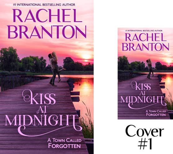
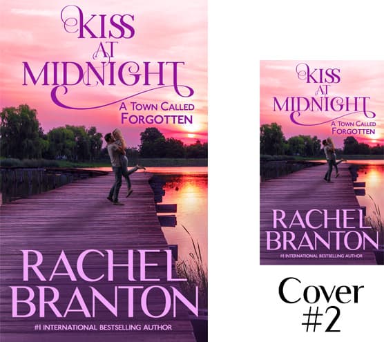
Thanks to everyone who voted and commented on the draft covers for Kiss at Midnight, the first book in my new upcoming small town series. After reading all the feedback, comments and preferences, we have created two final covers that we hope will attract both the no-couple-on-covers lovers and those who want couples. The “kiss” happens later, yes, but this image is setting the scene (midnight does not make for a romantic book cover). Please vote for the one that is most visually appealing to you. I’ve included large and small of both covers so you can get a feel of what they will look like on vendor platforms. Thumbnails are particularly important on sales channels. In case you’d like to do see what other new 2020 romance releases of other authors look like, you can look at this link (ignore the “sponsored” titles as they are not usually new releases).
Thanks to those who voted! The form is now closed for voting, but you can still comment here.
And the winner is . . .
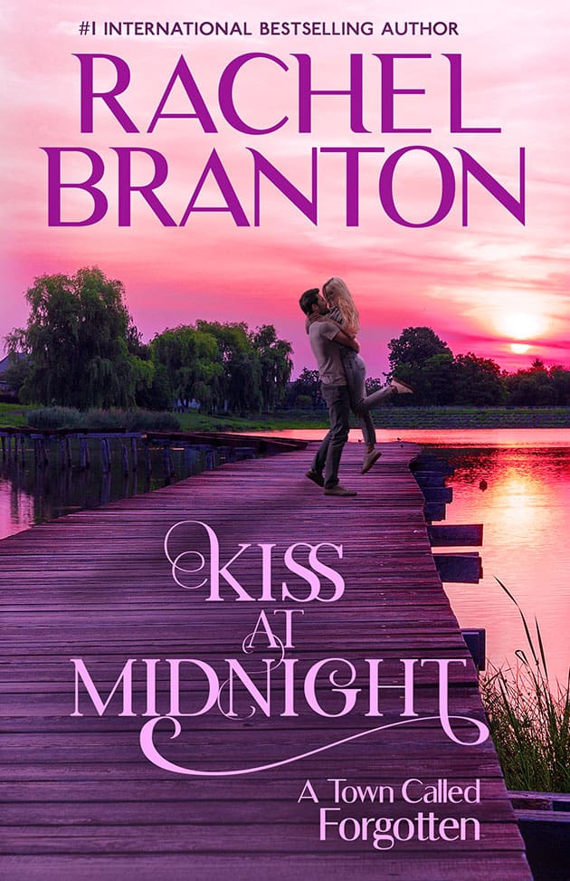
Copyright 2020 Teyla Rachel Branton
Danielle McDonald
numbr 1
Laraine Hall
I vote for cover #2, visually , it more pleasant to my eyes. But I’ll read the book regardless to which cover you’ll choose.
Shirl Halverson
In a sense I like them both. I like how when the title is on the bottom ; how under the title the phrase stands out more about a town called forgotten. But I like the title more on top than on the bottom. I realize splitting the title and the comment about the town probably doesn’t make sense. To me I look at the cover, the title then the author; in that order if it’s one that I haven’t read or only read a little of. If it’s a favorite author then I can pick them out a mile away; as they have a certain cover type that is their style. In short I’d have to say in voting that it depends on which your selling the most; the book or the author. Make that be your eye catcher and develop that one of a kind style all your own. What you have is great and I’m by no means an adviser of what sells books. May the Lord bless you. Amen
Cathy Davidson
Book 2
Pieter
Reason for author name to top, brings the fact of the story down to the couple and not another “pie in the sky” dream only 😉
Patricia
I like cover 1 best as it flows better it’s not so busy
I buy all my books on line and cover 1 would grab my attention first
Dianne Chase
My favorite is the second cover. The couple’s shadow on the wood planks adds depth and also highlights the glow of the sunset. On the first cover, the title font hides the shadow and shortens the perspective. Thanks for sharing your process! And good luck with your pick.
Taryn
I prefer author name on top. Seems too busy the other way
Pat Bullock
I like the title at the top. The purple color and the font selected for the title have more impact against the evening sky background rather than on the dock or pier.
Marcia Diekhoff
Title at the top stands out from the background much better. At least to my eyes.
Deborah English
I like the title at the top. The coloring of it reminds me of midnight.
Christi Hampton
I liked the title at the top only because the cover looked more evenly spaced, the one with the title on the bottom seems to be cutting into the couples feet, If it was smaller print or just a space lower I think I would like it better with the title on the bottom, oh and I do love that the couple are more in the background and not the focus of the cover.
I also like that your name is very easily read and bold, and that the title is a different font and not as
bold.
Thanks for asking for our input. I will ready it either way you choose.
Angie M
I read mostly online now, so if I’m searching for a new book, the title is the draw that makes me look twice at a digital book. If I’m a fan of the author, I’ll be notified by email about the book, or otherwise I would do a search by an author’s name to look for missed or new books. On the other hand, I can see either preference for print books, but still, I’ve always sought books by title.
Alicia Haney
I like the Title of the book on Top. The cover is Beautiful! A name for the B &B could be Cozy B&B or The Get Away B&B or B&B GetAway
Wendy Cooke
I think they both look nice.
Louise Pledge
I’d rather spit the author’s name first than the title. I select my books by author, not title (95% of the time). Beautiful covers, btw!
Hollie
The font for title gets lost at the bottom. The larger author font stands out best at bottom. Just my opinion!
Nina
I like the second one because it looks a little less busy for some reason. I also prefer having the title of the book at the top, since that’s what I’ll be reading.
Christine Griffin
I like the authors name at the top as I think a lot of people will see that & look to see what book is about.
Kathryn
Name on top is a cleaner look/figures more revealing…otherwise it appears too busy. Like the added smaller figures
Mary
I thought the top title was best between the two… but the choice would I’d buy either with your name on it anywhere!
Nancy
I agree that the name of the book should be bolder than the authors name. But I also like to put a face to the characters in the book. The couple are a little small for me. To me being able to visualize a character with a face makes the book more personal and more interesting.
Sharon Waldner
Like them both, but asked my 18 year old n she said top. She likes the contrast on them.
Crystal
Author name on Top. I like cover #1 best. Both are OK but #1 is better.
Lorraine Gwilliam
I like the title on top. Author name pops on the bottom with the simpler font, but I want to know what is in the book. Anything I find under any of your names, I I’ll like but the title gives a hint of what the story will bring.
Michelle
I like your name on the bottom so the focus is on the name of the book.
Carolyn
My eyes tend to seek out the title at the top. Will love it either way!
Nancy Shaw
I like your name on top. When I shop I look for the writers I love first and then decide on which book. Even I am looking for a best seller I like to go to the authors section. I can find books I missed and authors I’ve never read. Win!
Patty Fontenot Duplechin
I love both but if I have to pick, I would take the top one with author’s name on top
Cathy Davidson
I like them both.,,
Ted Davis
Love them both love your books
Teyla Rachel Branton
Thank you!
Les Collinge
I prefer the authors name on top
Teyla Rachel Branton
Thanks, Les!
Athena Brown
I agree with Barbara, the couple being in the background and not the foreground does make it more appealing to the eye. I do like your name on the bottom so the focus is on the name of the book which will then make (at least me) look at who it is by then.
Teyla Rachel Branton
I appreciate the feedback! Thanks!
William Vegvari
I’m a bit of a traditionalist and prefer the Authors’ name on top so no.1 for me
Teyla Rachel Branton
Name on top seems to be popular with the “in authors” these days, lol.
Barbara
I like that you made the couple smaller. I felt they were overpowering before. Nice cover!
Teyla Rachel Branton
Thanks. I like both a lot better than before too!
Shirley-Ann Patterson
The top name/title is what draws the attention to the book. Do you want people to be drawn to the book because of the author’s name, or because of the title? Personally, I think the title should be slightly bigger than the author’s name and should be the main focus. People will see who the author is anyway. I think it’s too much having the title and the author’s name in large font. There’s barely enough room for the picture, and yet the picture and the title should compliment each other.
Teyla Rachel Branton
Thank you for the comments. I appreciate it!